Gestalt Principles of Art and Design
These theories of painting come from a German form of psychology called Gestalt which simply states that the whole is greater than the sum of its parts. It is often used in both art as well as design to achieve the desired effect. The main points of Gestalt are summarized below the image.
1. Figure/Ground
This is the idea that speaks to the human mind's tendency to separate figures from their backgrounds. These differences can be furthered by utilizing a number of different techniques which can include contrast, color, intensity, and size.
In the Matisse painting below we can see a clear differentiation between figure and ground. It is also helpful to think of the ground as the negative space around the figures present. Also notice how Matisse utilized contrast, as well as color to make the figures come to the front of the painting, and push the background back in space. In general it is a good rule of thumb to think that warm colors will come forward in space while cool colors recede.

In contrast to how Matisse used Gestalt principles to make his figures stand out in space we can look at the French artist Vuillard who played around with blending the background and the figures present in the image below. Notice how the woman who is closest to us seems to almost dissapear into the background while the man at the door has a sharp contrast against the pattern. Vuillard was playing with the principles of Gestalt here to highlight how our eyes generally view paintings. By making the man at the door seem to pop to the front this creates a tension in the painting that some find desirable.

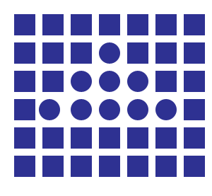
2. Similarity
This is the Gestalt theory that states that the viewer tends to group together objects which share the same characteristics such as shape, size, color, texture, and value. In the Degas painting below we can see how he employed many different circle shapes (in the form of the hats) in order to create a sense of unity throughout the painting. The hats also have similar textures which help us group them together. Notice how powerful color intensity is and how the hats which are brighter are easily grouped together while the other hats which are darker are a different group altogether.

The principle of similarity can be more easily understood in the following graphic below. Notice how even though all of the shapes are the same color that by changing the shape of the objects we also change how our minds group them together.
3. Proximity
Think of proximity as how close certain elements are in a composition. Proximity can also be referred to as grouping which is similar to similarity. However, there is a difference between similarity and proximity as we can see that the objects don't need to all be the same size in order to be grouped by the brain. In the Chardin painting below we can see how the apples are grouped together even though they are different sizes. Grouping can be achieved by shape, color, tone, and space.

In the painting below by Degas we can see how parts of a composition can be grouped together by their value. Even though there are figures both in the foreground as well as the background we can see how we group together the darker elements as abstract shapes. In the case of Degas' painting of The Office this is present in the dark shapes which make up the suit jackets of the subjects present .


4. Closure
As we discussed earlier closure is the idea that the brain will fill in any extraneous information which is not present in the image. This is a common tactic employed by both painters as well as designers.In the image below we can see how a square is created by the negative space.

5. Continuity
Continuity is the idea that the eye will continue to look in a direction in which it is pushed by the forms and shapes present. In the painting below by Tiepolo we can see how our eyes are first drawn to the main subject present which is the man riding a horse holding a large weapon. The weapon is pointing down at a figure which lie dead on the ground. By utilizing the Gestalt principle of continuity Tiepolo pushes the eyes of the viewer to move around the canvas.

6. Symmetry and Order
Symmetry and Order refers to the idea of how balance, and symmetry give the composition an overall feeling of solidity and structure. In Raphael's painting below we can see how by having a clear sense of symmetry adds to the structure of the entire composition. Notice how the figures aren't perfectly symmetrical on both sides of the work, however they are still balanced and neither side seems too "heavy".The larger idea at play here is that viewers want to "read" a painting in a systematic and organized manner. Some viewers who find a painting which is too difficult to read may spend less time trying to comprehend it. While clearly balanced compositions will be more accesible. This is not to say that every composition needs to be perfectly balanced and symmetrical, there are many examples of artists who play with the idea of symmetry and balance and still are quite sucessful. Remember that these principles are not set in stone, and it is ok to break them. The point being that the better you understand these principles the more sucessful you can be at breaking them.