Composition in Painting
Lesson 11:
Up to this point we've been focusing on some very basic skills. And many of the techniques and elements will be learned through practice. However, there is another part of becoming a painter that also requires practice. And that is teaching yourself how to look at, and create compositions within a picture plane. Your picture plane is simply the area in which you are drawing. It is the shape of your paper, or canvas. But that rectangle has certain rules regarding how to arrange the elements of your drawing/painting. Composition is the placement or arrangement of visual elements or ingredients in a work of art. It can also be thought of as the organization of the elements of art according to the principles of art.
Ok, so let's think about painting as we would a musical composition. Musical notes by themselves are not necessarily music until someone comes along and arranges those notes into a composition. The same is true for painting. The elements of music are notes, tones, keys, and beats per minute. These are like the skeletons of what music is made from.
So what are our Elements of Art? Well, here you go. ( I've coupled every element with an artist that makes it easier to understand.)
The Elements of Art
Line - the visual path that enables the eye to move within the piece (Ralph Steadman illustration)
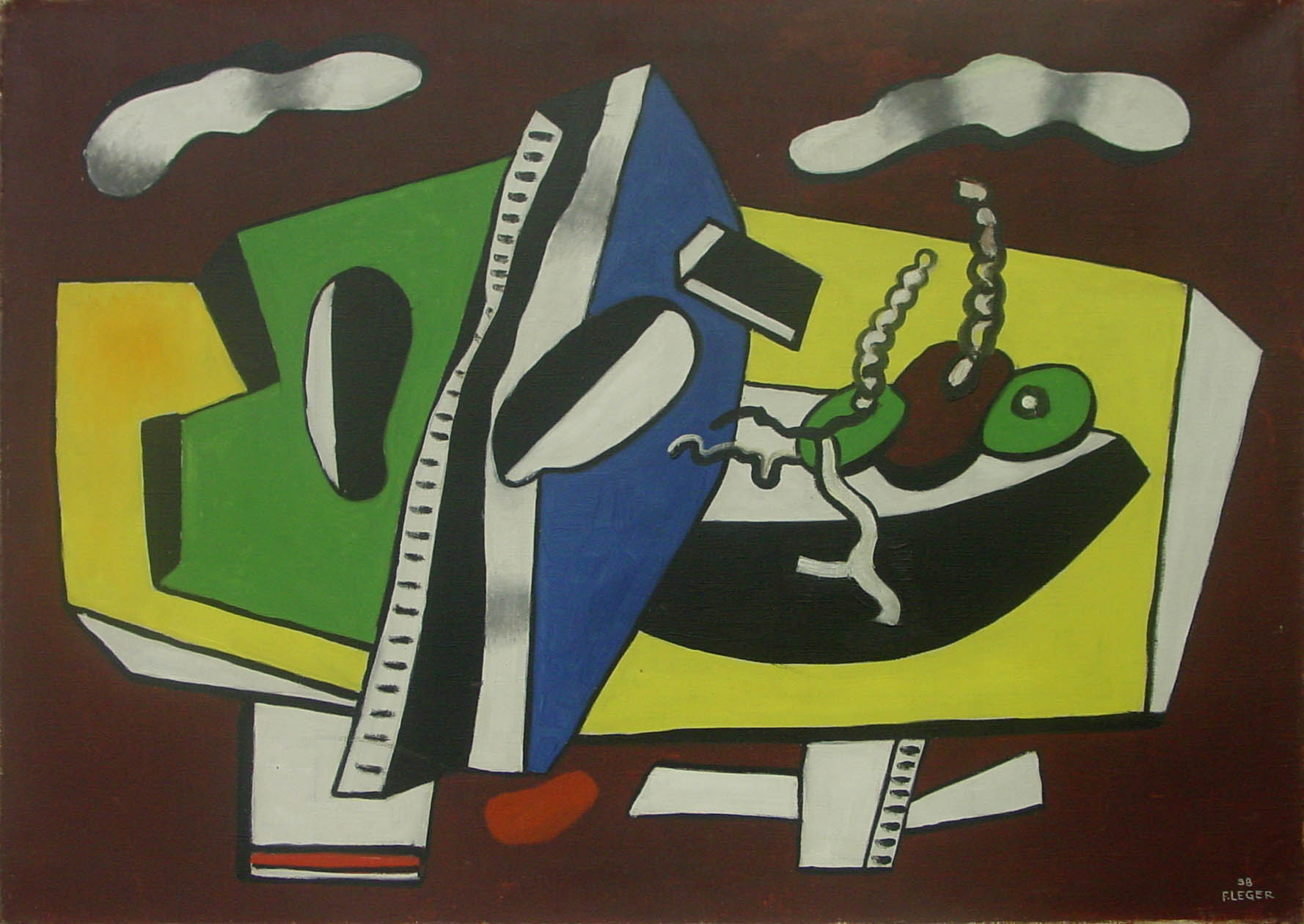
Shape - areas defined by edges within the piece, whether geometric or organic (Leger)
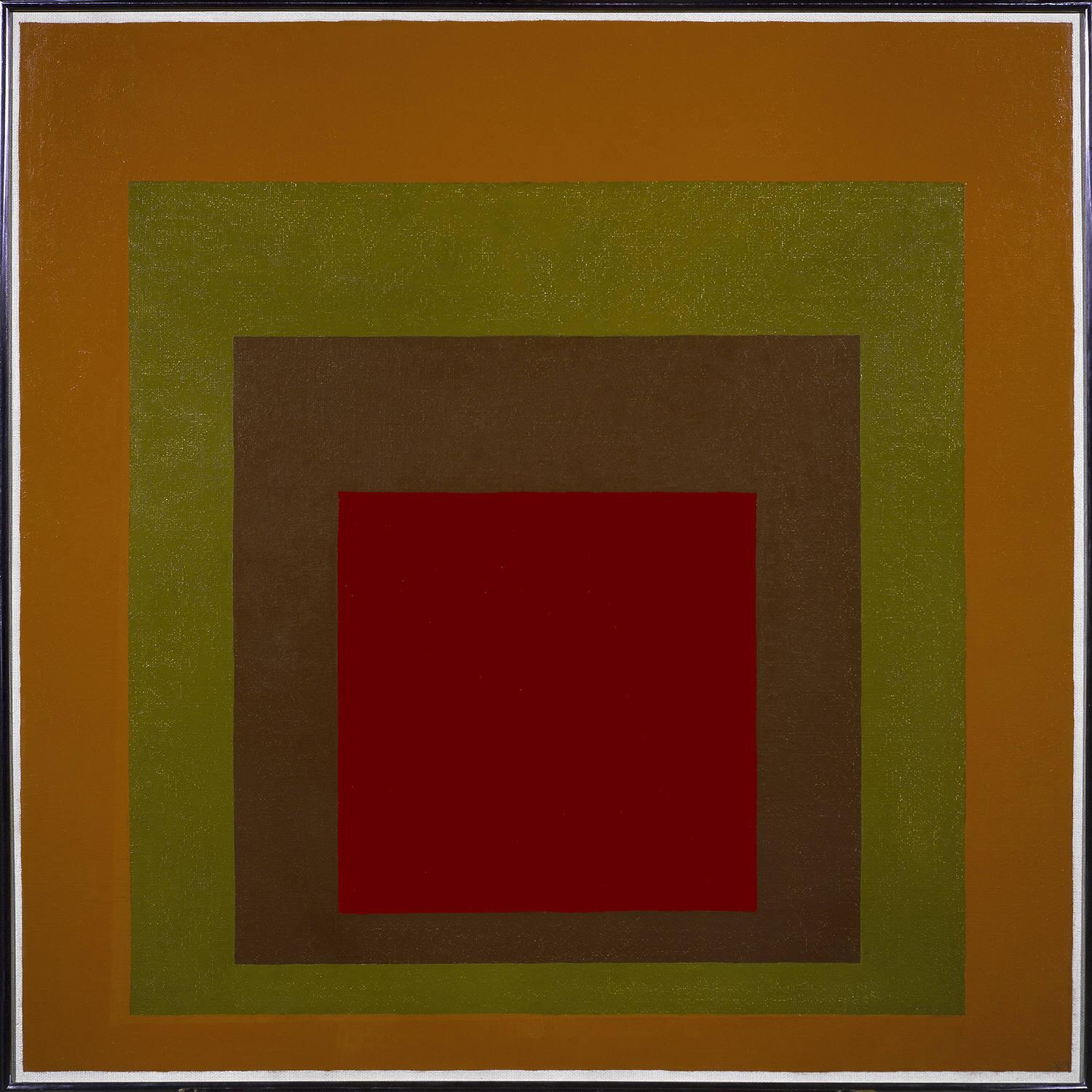
Color - hues with their various values and intensities (Josef Albers)
Texture - surface qualities which translate into tactile illusions (Albrecht Durer)
Form - 3-D length, width, or depth (Jenny Saville)
Value - Shading used to emphasize form (Carvaggio)
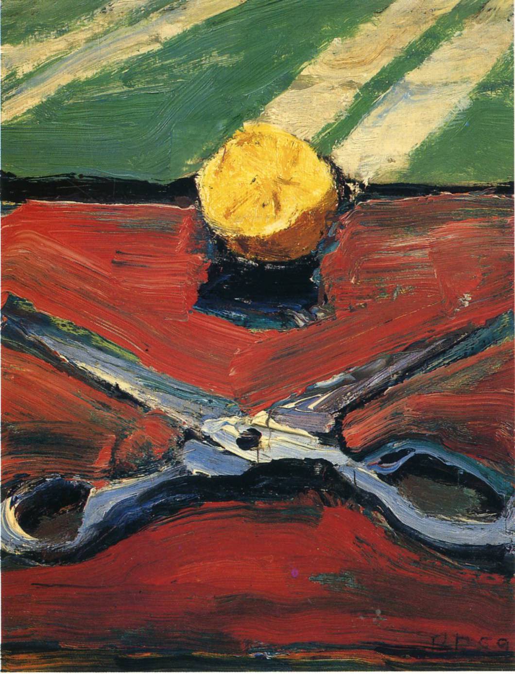
Space - the space taken up by (positive) or in between (negative) objects (Richard Diebenkorn)
Now you should have an idea as to what the Elements of Art are. Line, Shape, Color, Form, Space, Texture, Value. These are the skeleton, the basic elements. So let's get back to what makes a composition. As we previously stated a Composition is the organization of the elements of art according to the principles of art. The principles of art are the set of rules or guidelines of art that are to be considered when creating a piece of art. They are combined with the elements of art in the production of art. So these principles are somewhat more abstract than Line, or Color. But they aren't too difficult to understand. The principles are movement, unity,harmony, variety, balance, emphasis, contrast, proportion, and pattern.
Movement
Movement shows actions, or alternatively, the path the viewer's eye follows throughout an artwork. Movement is caused by using elements under the rules of the principles in picture to give the feeling of action and to guide the viewer's eyes throughout the artwork. (Degas)
Unity
Unity is the quality of wholeness that is achieved through the effective use of the elements and principles of art. The arrangement of elements and principles to create a feeling of completeness. (Japanese Print. Artist Unkown)
Harmony
Harmony is achieved in a body of work by using similar elements throughout the work, harmony gives an uncomplicated look to your work. The way the picture makes everything come together.
Variety
Variety (also known as alternation) is the quality or state of having different forms or types. The differences which give a design visual and conceptual interest: notably use of contrast, emphasis, difference in size and color. (Diego Rivera) Also check out how he used pattern, and repetition to create Unity!
Balance
Balance is arranging elements so that no one part of a work overpowers, or seems heavier than any other part. The three different kinds of balance are symmetrical, asymmetrical, and radial. Symmetrical (or formal) balance is when both sides of an artwork, if split down the middle, appear to be the same. The human body is an example of symmetrical balance. The asymmetrical balance is the balance that does not weigh equally on both sides. Radial balance is equal in length from the middle. An example is the sun. (Wayne Thiebaud)
Contrast
Contrast is created by using elements that conflict with one another. Often, contrast is created using complementary colors or extremely light and dark values. Contrast creates interest in a piece and often draws the eye to certain areas.(Raymond Pettibon)
Proportion
Proportion is a measurement of the size and quantity of elements within a composition. In ancient arts, proportions of forms were enlarged to show importance. This is why Egyptian gods and political figures appear so much larger than common people. The ancient Greeks found fame with their accurately-proportioned sculptures of the human form. Beginning with the Renaissance, artists recognized the connection between proportion and the illusion of 3-dimensional space. (Brueghel)
Pattern/Rhythm
Pattern and rhythm (also known as repetition) is showing consistency with colors or lines. Putting a red spiral at the bottom left and top right, for example, will cause the eye to move from one spiral, to the other, and everything in between. It is indicating movement by the repetition of elements. Rhythm can make an artwork seem active. (Duchamp)
Now that you've got a good idea about all the elements and principles of Art is is time to incorporate them into some small sketches.
Drawing #19 Thumbnail Sketches of the 9 Principles of Art.
Time Required: 30 minutes to 1 hour
For this drawing you will first draw 9 small boxes evenly spaced across your paper. In each box you are going to illustrate a principle of design using only rectangles and squares. No round edges! Really think about how to best illustrate each principle and you'll start to get a feeling for what they really mean. These types of visual thinking are better taught through practice rather than words and explanations. You can see an example of a students drawing below.
Drawing#20 Small object compositional sketches.
Time Required: 1 Hour 30 Minutes
For this drawing you will divide your paper into smaller sections (at least 5) . In each small rectangle draw a sketch for a composition based upon 4 or 5 different small objects. Play around with proportion and cropping the image. Make sure your composition incorporates all four edges. This is most easily achieved by having the objects you are drawing to be cropped off be the edge of your picture plane. Then start working with different principles of art, and look at how you can use these ideas to create more interesting compositions.


