Lesson 7: Line Variation

Line Variation

Lesson 7

Line Variation.

Drawing #13 "Line Variation Shoe"

In these drawings you are going to be exploring line variation. It is important that the lines in your drawings have varying thicknesses. Because of its versatility and ability to make highly varied lines we will be using a brush and ink. This will make the drawing appear more lively and dynamic. Later on will start exploring how different line thicknesses can also give a drawing "weight" but for this first drawing just trust your intuition and vary the thickness of your line. Before you start the shoe drawing I want you to fill up a page full of extremely varied squiggly lines. Get used to your brush and the type of line it makes, how it responds to different pressures. Then, once you feel comfortable you are going to move onto drawing your shoe. You may feel a bit of trepidation when you start the shoe drawing


line-variation.jpg


because ink is so permanent, and there's no eraser. This should only make you concentrate harder. If you screw up a line, don't worry about it. Remember the practice is the most important thing at this point and not the finished drawing. Take 5 minutes to fill up a page full of squiggly, highly varied, lines, and then another hour doing at least two shoe drawings.

shoe-brush-drawing-med.jpg
line-variation-braid-med.jpg

Sketchbook: Drawing #14 "Line Variation Braids"

For this drawing you are going to have use you imagination. You are going to be creating an abstract drawing with form using nothing but line, and your brush. The structure of the drawing is simple. The bigger fatter lines come as all the lines converge at a certain point. You can make the shapes any way you want but just play with the thicknesses of your lines


Lesson 8: Drawing form

Drawing Form

Lesson 8

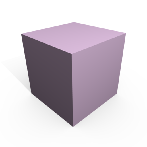
Now that we have got a good grasp of line, and the importance of varying our lines in our drawing we are going to continue on to another huge element of drawing/painting. That important element is form. Correctly understanding form will give your paintings/drawings more depth. Traditionally schools have taught students to look for four key forms. These are The Cube, The Cylinder, The Sphere, and variations and combinations of these forms.


cube.png


cylinders.jpg


Sphere.png

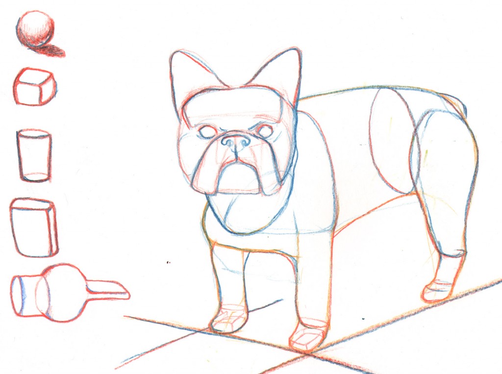
Using combinations of these three basic forms can enable to draw virtually anything on the planet. It is no mistake that all of the 3D animation software available on the market utilizes these three forms. So why is this important for drawing and painting? So far we've been examining what we can see with our own eyes and trying to duplicate it, however, we must remember that we are trying to render the 3 dimensional world onto a 2 dimensional surface. These common forms are like letters which create words. To put it simply our brains know how to read these forms when we see them.


french-bulldog-drawing-1024x763.jpg

I want you to start seeing everything as if it were transparent in an attempt to better understand the underlying form which holds it all together. For hundreds of years people in figure drawing classes will often stand up and look at both sides of the model which they are drawing. They do this because they want to see how the whole form works together. The angle from which you look at a subject is important, and as an artist you want to gather as much information as possible about the subject you are drawing. That means thinking about what you can't see, as well as can see. Keep your edges soft and rounded. We don't want anyone to get hurt if your creature runs into them.

Drawing #15 Industrial Drawing of an animal

For this drawing I want you to find a picture of an animal, and draw it only using these basic forms. Think of yourself as if you are making a schematic drawing. You want to make a detailed blueprint of this animal because you are going to put it into a rocketship and blast it off to a foreign planet. Where no one knows what a French Bulldog (or the animal of your choice) looks like. ;)

This lesson is especially great for those interested in pursuing a career in 3d animation. Most people don't realize, but all those characters in all of those big budget animation films start off with a sketch. That's right. Good old fashioned pen and paper.

You may take up to 2 hours to complete this drawing. Make it as detailed as possible.


Lesson 9: Measuring

Drawing Skills: Measuring

Lesson 9

This lesson will deal with learning how to improve your drawing skills by creating a unit of measurement for drawing. You will use your pencil to measure and draw a still life which will be set up in front of you. In the first drawing by Honore Daumier you can see that the practice goes back many hundreds of years. People still use it, because it works.


daumier-pupil-teacher-drawing.jpg

All you have to do is hold a pencil or brush at arms length, close one eye, and move your thumb up or down the pencil to make a measurement. then compare that measurement to something else. Check out these two photos of me measuring distances between points on my guitar.

measurement-drawing-2.jpg


Here I measure from the bottom of the hole to where the neck meets the body.

measurement-drawing-1.jpg


I then keep my thumb in the same place on the pen, and compare my first measurement against the new one. Now I can make a better estimate as to how wide I need to draw the guitar. Judging from this photo it is about 1 and 1/3 pens wide at that point. Now correlate these measurements onto the paper in front of you. Remember, you don’t have to draw it to the scale of your pen measurements. Once you’ve committed to the first initial marks on your drawing you have already created a measuring system.Your units can be whatever size you desire.


Drawing #16 - Measuring and drawing a corner of the room.

For this drawing I want you to draw a corner of the room while using this technique. Set aside one hour of time for this drawing and keep measuring and drawing until the hour expires. Remember that it is important to get a base unit of measurement first!

Lesson 10: Shadows and Lights

How To Shade

Continuing our exploration of the elements of drawing/painting now leads us to Value and how to shade. Value is the term we use when referring to how dark or light a shadow is. This is extremely important as we progress towards painting because every color also has a darkness. We will be exploring the value of color in subsequent lessons. This easiest way to understand Value is to think about shading. The "value" is basically how dark the shading is.

Another important thing to remember is that every object because of it's color will utilize a different section of the value scale. In the interest of clarity we will assign each differnt darkness on the value scale a number. 0 will be the darkest dark and 10 will be the lightest light. Thinking this way enables us to see what range of values we will need to utilize in our drawings. A black bowling ball in low lighting will have a value scale of around 0 to 6, while a snowman in the sun will have a value scale of around 4 to 10. It is impotant to know where the objects we are drawing lie on the value scale because we want to accurately portray what is in front of our eyes. It is quite common that during figure drawing sessions that a beginning student will make the entire drawing all too dark. Making a caucasian model appear as if they were of African decent.

Drawing # 17 Value Scales

For this drawing you will be utilizing the grid below. Print out the grid provided and do your best to shade the values as close as possible. You can apply shade in a number of ways. As you can see in the example below the student has utilized different techniques including scribbling, making little circles, holding the pencil on it's side, pointalism, and cross hatching. Get creative and explore different ways to apply value to paper.

value-scale.jpg
value-scales-med-789x1024.jpg


Now that we have some practice matching values we can move on to applying what we've learned here to a drawing. Find an image (photograph) which has a broad range of values. Print it out (or you can use a photo or magazine image) . It is important that you also have a printed out value scale at this point, or you can use the one you just shaded. As you look at your image - hold up the value scale right up against the image and find out how dark you will need to render the drawing. Be careful when looking at your lights (whites). Many times what you may assume is the whitest white ( 10 ) on the value scale will be closer to a light gray ( 7 ) . It is not necessary to include all 10 values in one drawing. When you are starting out just try to get three or four different values in your drawing. The more values you can realistically render, the more realistic the drawing will look.

Drawing #18 - Value Drawing from a printed image (charcoal)

Set aside an hour and half of time and try to copy the images major values as accurately as possible. Start off with gray paper. You can buy gray paper, or rub down a white sheet of paper with charcoal and rub it in with a tissue until the entire page is a silvery gray. Start off plotting out where the darkest darks go and work towards the light. If you are using gray paper then you can use white chalk to render your lights. If you made your paper gray by rubbing it down with charcoal you can use your eraser as a drawing tool and you will simply erase your lights. You can use charcoal pencils, or the old fashioned sticks. Once the drawing is finished you can"fix" the drawing by spraying it with an aerosol hairspray. This will prevent the drawing from smudging. There are commercial fixatives available but there's nothing wrong with just using hairspray.

How many different values can you see represented in the example drawing below? Before you learn how to shade you must learn how to see different values. Once you can look around a room, and imagine that everything is black and white, then you will know that you can draw virtually anything. How to shade is in reference to a technique such as cross hatching, or scribbling.

skull-drawing-med.jpg

copy of a duane kassan drawing

Lesson 11: Composition in Painting

Composition in Painting

Lesson 11:
Up to this point we've been focusing on some very basic skills. And many of the techniques and elements will be learned through practice. However, there is another part of becoming a painter that also requires practice. And that is teaching yourself how to look at, and create compositions within a picture plane. Your picture plane is simply the area in which you are drawing. It is the shape of your paper, or canvas. But that rectangle has certain rules regarding how to arrange the elements of your drawing/painting. Composition is the placement or arrangement of visual elements or ingredients in a work of art. It can also be thought of as the organization of the elements of art according to the principles of art.

Ok, so let's think about painting as we would a musical composition. Musical notes by themselves are not necessarily music until someone comes along and arranges those notes into a composition. The same is true for painting. The elements of music are notes, tones, keys, and beats per minute. These are like the skeletons of what music is made from.
So what are our Elements of Art? Well, here you go. ( I've coupled every element with an artist that makes it easier to understand.)

The Elements of Art

Line - the visual path that enables the eye to move within the piece (Ralph Steadman illustration)

alice-in-wonderland-drawing.jpg


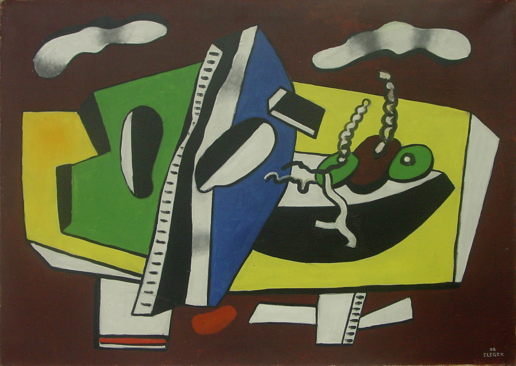
Shape - areas defined by edges within the piece, whether geometric or organic (Leger)

leger.jpg


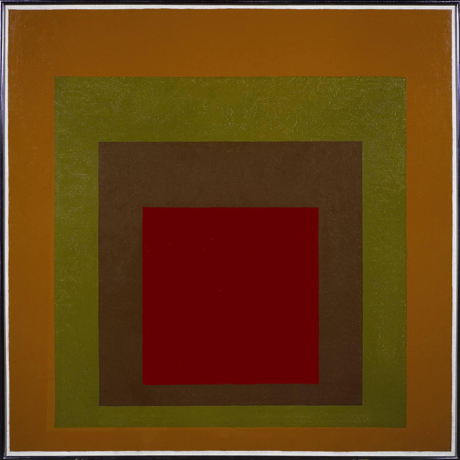
Color - hues with their various values and intensities (Josef Albers)

Homage-to-the-Square-Gained-1959-Josef-Albers.jpeg

Texture - surface qualities which translate into tactile illusions (Albrecht Durer)

durer_rabbit.jpg

Form - 3-D length, width, or depth (Jenny Saville)

Jenny-Saville-fat-Female.jpg

Value - Shading used to emphasize form (Carvaggio)

david_and_goliath_by_caravaggio.jpg

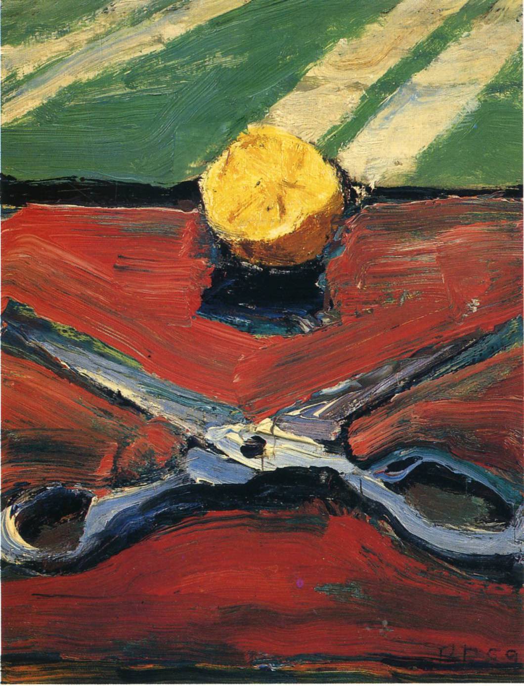
Space - the space taken up by (positive) or in between (negative) objects (Richard Diebenkorn)

diebenkorn-scissors.jpg

Now you should have an idea as to what the Elements of Art are. Line, Shape, Color, Form, Space, Texture, Value. These are the skeleton, the basic elements. So let's get back to what makes a composition. As we previously stated a Composition is the organization of the elements of art according to the principles of art. The principles of art are the set of rules or guidelines of art that are to be considered when creating a piece of art. They are combined with the elements of art in the production of art. So these principles are somewhat more abstract than Line, or Color. But they aren't too difficult to understand. The principles are movement, unity,harmony, variety, balance, emphasis, contrast, proportion, and pattern.

Movement
Movement shows actions, or alternatively, the path the viewer's eye follows throughout an artwork. Movement is caused by using elements under the rules of the principles in picture to give the feeling of action and to guide the viewer's eyes throughout the artwork. (Degas)

degas-horses.jpg

Unity

Unity is the quality of wholeness that is achieved through the effective use of the elements and principles of art. The arrangement of elements and principles to create a feeling of completeness. (Japanese Print. Artist Unkown)


unity-art.jpg

Harmony

Harmony is achieved in a body of work by using similar elements throughout the work, harmony gives an uncomplicated look to your work. The way the picture makes everything come together.

van-gogh-iris.jpg

Variety

Variety (also known as alternation) is the quality or state of having different forms or types. The differences which give a design visual and conceptual interest: notably use of contrast, emphasis, difference in size and color. (Diego Rivera) Also check out how he used pattern, and repetition to create Unity!

diego-rivera-creation-popol-vuh.jpg

Balance

Balance is arranging elements so that no one part of a work overpowers, or seems heavier than any other part. The three different kinds of balance are symmetrical, asymmetrical, and radial. Symmetrical (or formal) balance is when both sides of an artwork, if split down the middle, appear to be the same. The human body is an example of symmetrical balance. The asymmetrical balance is the balance that does not weigh equally on both sides. Radial balance is equal in length from the middle. An example is the sun. (Wayne Thiebaud)

wayne-thiebaud-balance.jpg

Contrast

Contrast is created by using elements that conflict with one another. Often, contrast is created using complementary colors or extremely light and dark values. Contrast creates interest in a piece and often draws the eye to certain areas.(Raymond Pettibon)

pettibon-ink-drawing.jpg

Proportion

Proportion is a measurement of the size and quantity of elements within a composition. In ancient arts, proportions of forms were enlarged to show importance. This is why Egyptian gods and political figures appear so much larger than common people. The ancient Greeks found fame with their accurately-proportioned sculptures of the human form. Beginning with the Renaissance, artists recognized the connection between proportion and the illusion of 3-dimensional space. (Brueghel)

brueghel_hunters.jpg

Pattern/Rhythm

Pattern and rhythm (also known as repetition) is showing consistency with colors or lines. Putting a red spiral at the bottom left and top right, for example, will cause the eye to move from one spiral, to the other, and everything in between. It is indicating movement by the repetition of elements. Rhythm can make an artwork seem active. (Duchamp)

duchamp-nude-descending-staircase.jpg

Now that you've got a good idea about all the elements and principles of Art is is time to incorporate them into some small sketches.

Drawing #19 Thumbnail Sketches of the 9 Principles of Art.

Time Required: 30 minutes to 1 hour

For this drawing you will first draw 9 small boxes evenly spaced across your paper. In each box you are going to illustrate a principle of design using only rectangles and squares. No round edges! Really think about how to best illustrate each principle and you'll start to get a feeling for what they really mean. These types of visual thinking are better taught through practice rather than words and explanations. You can see an example of a students drawing below.

principles-of-art-design.jpg

Drawing#20 Small object compositional sketches.

Time Required: 1 Hour 30 Minutes

For this drawing you will divide your paper into smaller sections (at least 5) . In each small rectangle draw a sketch for a composition based upon 4 or 5 different small objects. Play around with proportion and cropping the image. Make sure your composition incorporates all four edges. This is most easily achieved by having the objects you are drawing to be cropped off be the edge of your picture plane. Then start working with different principles of art, and look at how you can use these ideas to create more interesting compositions.

composition-drawing-1023x718.jpg


Lesson 12: Intro to color theory

Color Theory Basics

In this Lesson you will learn:

1) What type of paint to buy (Materials)

2) How to control color intensity (Intensity)

3) How to see the value (shade) of color. (Color Value)

Materials

First things first! It is important that you know how to buy the right paint for what you want to do.

There's two types of paint. Transparent and Opaque. When you start painting it is HIGHLY recommended that you start by using only opaque colors. This will reduce the possibility of your paintings becoming streaky and dull. Transparent colors can be used later when we get into glazing. For now you need some strong opaque colors in order to learn how to mix your colors and get them to stick to a surface. So how do you identify which colors are opaque, and which are transparent? Many tubes of paint will have a small box graphic usually on the front underneath the brand name. If the box is black, then it's opaque. If the box is half full then it's semi-transparent. And if the box is white, then it's transparent. Stick to the basics.

The ideal starter palette of Opaque colors would include

Cadmium Red Medium

Cadmium Yellow Medium

Cobalt Blue

Titanium White

That's it. You can mix all the colors you'll need from these three. It should be noted that Cadmiums are toxic, as is Titanium white. So don't eat them. They're the best available and have been used for centuries. If you're scared of them then ask the person at the store for help finding other opaque primary colors. I don't know of any.

Second thing you need is a brush. For brushes there are a few different types. For now just buy a simple mid sized Flat, or Philbert. Around a 6 to an 8 (that's the size as indicated by a number stamped on the brush). You don't need any little brushes for details. Not yet. Just get some flat synthetics like the one below, and you'll be fine.

flat-brush.jpg


Find an old cup you don't want to use anymore to hold some water. And for a palette you can use a piece of cardboard.

color-wheel.jpg

The Color Wheel

At this point in the course you will be concentrating on a few basic elements of color theory. This will be expanded upon later but currently you need to grasp the essentials so you can begin painting.

The three primary colors are Red, Yellow, and Blue. Primary colors are called "primaries" because they aren't a mixture of two other colors. When you mix two primary colors together you get a secondary color. The secondary colors are???…..You guessed it. Orange, violet, and green. Easy isn’t it? So, for those who don’t know, in order to make violet you mix blue and red. To make orange you mix red and yellow. And to make green you mix blue and yellow. Pretty straight forward.

Now, we’ve got some colors that are opposite each other on the color wheel. yellow is opposite violet, orange opposite blue, and green opposite to red. These colors which are on the opposite side of the color wheel are called complimentary colors. It is important to memorise all the colors compliments because you use a color’s compliment in order to control color intensity.

color-intensity.gif

Color Intensity

Color intensity is, well, the intensity of a color. Think about it as "brightness" or "radiance". Color straight out of the tube is generally high intensity. In order to lower the intensity of a color (aka make it less bright) you are going to add a small amount of it's complimentary color. For example: for red, you add a small amount of green to lower the intensity of the red. Just a dab of green and the intensity of that red will come down. Yes they do get darker.

Now, Take a look at the image below. We’ve got a red which is super intense at the top, then by adding green to that red we take down the intensity (as indicated by the second strip down). I know what you’re thinking. It looks brown!! That is where you have to be careful. Take a look at the second image. That is the “brown” (or more correctly a lower intensity red) surrounded by a black box. That brownish red in the context of another color will be red. For the purposes of this course you will be taking down the intensity of all of your colors by adding their respective secondary colors. This is because our eyes rarely see super intense colors in the real world.

red-color-intensity.jpg
red-black.jpg

Assignment #21 Playing with color intensity.

For this assignment you will start with an intense color, and then slowly add it's complimentary color in gradual amounts to create a color intensity scale. As you can see in the examples below you can start with a Red, then add a bit of green to get the second gradation, and then more green to that mix to get the third gradation etc. When it comes to dark colors (Blue, and Violet) you can add a bit of white to these in order to see the color intensity manipulated.

color-intensity-1.jpg
color-intensity-2.jpg


The Value Of Color

color-value.jpg

The darkness or lightness of a color is its value. Just as we can make grey scales from pitch black to white, we can also do the same with colors. Take a look at the image below. We’ve got our happy little primary and secondary colors cascading from light to dark.

color-value-black-white.jpg

This is the one you will be copying.

Now lets look at how we can use the value of color in painting. Check out this painting by Rolling Stone illustrator Philip Burke. Notice how the shadows of the face are done in green, and bright dark reds, but the painting still flows and makes sense. This is because the green/red is the correct value which corresponds to the shadow. You can throw any color in there and it will makes sense as long as the darkness of the color correctly matches. Think of whatever you are painting as a black and white photocopy, and you are simply mixing your colors to match the various greys on the photocopy. Also beware of red, it seems lighter than it really is. A medium red is actually very dark.

philip-burke.jpg
philip-burke-scale.jpg


vuillard.jpg

Now compare the high value contrast of Philip Burke with the low level color contrast of Edouard Vuillard. In Vuillard’s painting he broke the rules of what color value meant by keeping all of his colors this medium grey. The gradations in value are extremely subtle, but they are still there nonetheless. In the black and white copy of you can still make out how Vuillard finely manipulated the value of his colors to create shadows and depth.

vuillard-copy.jpg

Assignment #22 Color Value Scale.

For this assignment you will be copying the color value scale above. The important thing to remember is that you'll start with the color out of the tube

Important NOTES!:

Many claim that the real color wheel contains Cyan, Magenta, Yellow, and K (which stands for key, not black) . This is true for printing processes and was largely taught to graphic design students in the 1990s. However using cmyk as a color wheel for painting doesn't make much sense because it ignores a few important factors.

For instance. In printing, in order to make red, one must mix magenta with yellow optically. This means that in order to get a true red (following the cmyk model) you would need to mix a magenta, and then put a thin glaze of yellow on top of it. But in painting there are many more variables at play. For instance there is no "red" as we all know when we go to buy paints. There's cadmium red, vermilion, and permanent rose and so forth and so on. But the point is that the red that we choose to start with can vary greatly from the get go. When you create any palette of colors you are immediately limiting yourself in some way.And if you limited your palette to cyan, magenta, yellow (not even specified), and key (which isn't a color, but a tone) then you would be given a different set of limitations.

There is one other commonly held idea about the "real" color wheel. It is a 12 color system based on a rainbow and the proponents believe that this gives an artist the largest possibilities for mixing . If you want to try it the colors are

Titanium White

Cadmium Yellow Pale
Cadmium Yellow
Cadmium Orange
Cadmium Scarlet
Cadmium Red
Quinacridone Rose
Dioxazine Violet
French Ultramarine
Thalo Blue
Thalo Green
Cadmium Green Pale

This set of colors could easily cost more than two hundred dollars. So that's one major downfall. The second is that you shouldn't think about one palette as your savior. It won't be, in fact in the beginning your palette should be limited because the more tube colors you introduce, the harder it will be to create any type of color harmony. Also you should remember that artists personal decisions as to what colors to use on their palettes is as varied as art itself. There is no absolute answer one way or the other. Giving a beginning student this 12 color rainbow mix would be like buying a 7 year a drum set the size of a living room.

The palette I have given above is a very powerful starter palette. As you may have noticed the weakest colors created by this palette were the greens, and the violet. If you are looking to make a stronger green then I'd suggest buying a Pthalo Green, and in order to push your violet I would suggest Dioxazine Violet. Remember though that it is important to master the basics before moving on to a more extended palette!

Lesson 13: Warm and Cool Colors

Warm and Cool Colors

Lesson 14

Warm and cool colors are important in painting for a number of reasons. The most obvious is that warm colors tend to move forward in space, while cooler colors tend to retreat. This is mainly because of how we experience the world and is pure science. Within the atmosphere there are zillions of little water molecules floating around. The largest of which form clouds and eventually dump rain on us. But the air itself also contains water. So when we are looking faw away to the horizon we are actually looking through a lot of air, which in turn means we are looking at more and more water molecules, and the hills in the distance start looking blue and purple. This is called atmospheric perspective. And it was first labeled and widely used by none other than Leonardo Da Vinci. The second feature of atmospheric perspective is that objects also tend to lose their contrast and take on the color of their background (ie. sky)


Mona_Lisa.jpeg

Mona Lisa (Leonardo Da Vinci) Classic example of how cool colors recede and warmer colors come to the forefront.

The second thing to remember about warm and cool colors is how they create balance and a sense of fullness within a piece. This is easier to do when painting a landscape where there could be a cool blue sky, and this could be contrasted against the warm orange color of some leaves. But take a close look at an object, and you should be able to see a multitude of other shades and colors within that object itself. The cooler colors can be tints, shades, or tones. But be careful because you can also find warmth in certain shadows as well. However, generally cooler colors are used as shadows, and warmer colors as mid tones, and highlights.

lucien-freud-sleeping-head.jpg

In this painting by Lucien Freud we can see very cool colors dominating many of the shadow tones. This may be because Freud often lit his models with fluorescent lights. Nonetheless look at the nice interplay between warm colors and cool colors in this piece. I've made a small scale of colors taken directly from this painting as an example to further study.

lucien-freud-palette.jpg

Extra Credit: Create a small painting using these same warm and cool colors for all of your values.

Lesson 14: Explorations with Acrylics

How To Paint With Acrylics

Lesson 14

When learning how to paint with acrylics the most important thing is to first understand the properties of the colors (pigments) you have chosen to use. As you learned in Lesson 12 Color Theory Basics the most important factor as to how your paint will perform is dependent upon whether or not it is an opaque color. Opaque Acrylic paints will cover a surface better and avoid streaky transparent colors. Then you've got to make sure you have a nice surface to paint on. You can check out my Painting on Masonite video if you are looking for a cheap and easy way to have multiple canvases available at all times.

I received a few questions on twitter regarding the fact that I don't use a paint knife, but instead use my brush to mix my colors on my palette. Instead of trying to explain with words my technique for mixing colors I thought it would just be easier to show so I made this short video.


Once your brush is fully loaded it's time to paint. When painting with acrylics it's important to use a lot of paint and kind of glide it onto the surface. If you've got a heavy hand you've got to lighten up a bit and just let the paint slowly flow off the brush. You can see in the video above when I was pushing harder this actually caused the paint to be more transparent (even though Im using opaque colors) so I went over the stroke again with a lighter stroke and this actually worked better.

When you are painting with acrylics (or oils for that matter) you are going to need to pay attention to two different types of edges which you will see in your subject. These two edges are soft (blended) , and hard. The easiest place to see this is in paintings done of tapestries. In this painting by Carvaggio we can see how he used both soft (blended) values with hard edges.

carvaggio-painting-tapestry.jpg


Look at the dark shadows and how they are crisp and hard, and then look at the large sections of fabric that slowly gradate from light to dark. These are the two types of marks you want to focus on creating. Always ask yourself when painting a shadow, "does this shadow have a hard edge, or a soft edge?" Does the light slowly gradate from light to dark, or is there a hard cast shadow cutting across/behind the object?

For the next assignment you will be creating paintings of the four different shapes found in nature. These are the cube, the cylinder, the cone, and the sphere. These forms can be used in conjunction with one another to create a multitude of different objects and creatures as you learned in Lesson 8 Drawing Form. Now you will be painting them. The process works best if you have some nice white objects that you can set up with a light. But I understand that most people don't have access to these so I've given you the four different shapes from which to paint below. Your brush shouldn't shade each form the same. For instance, while working on the cube think about making long flat marks. When painting the sphere you can act as if your brush is following the form which it is painting. When Painting the cylinder the strokes will be small little crescents. You will draw a basic sketch with a dark color first, and then plop down large areas of where your highlights and mid tones will be. The last step is to blend it all. There's a few ways to do this. They are called the "dry brush blending" and "wet into wet" (alla prima) techniques.

With dry brush blending you wipe your brush with a rag after you've applied a color. It doesn't need to be free of all paint, just DON'T put it in your water first to clean it. You want the brush to be dry. After you've applied two different values beside each other you can use the dry brush to mix the two values together, this could also create a third middle tone. Watch the video below to see how dry brush blending works with acrylics.

Assignment #23

Using black and white acrylic paint you will paint each of the four forms to the best of your ability. You can use the following images as your source material. Take a look at a previous students work if you need inspiration.

cone.jpg

Cone

cube-shape.jpg

Cube

cylinder-shape.jpg

Cylinder

sphere-shape.jpg

Sphere